Tuesday, April 30, 2013

Four designs using only five black squares

1: A square falling in a 'flipnote' style.


 2: Squares falling into a stacked pyramid.


 3: A formation of large squares moving in unison.                            


4: 4 squares pinning the 5th square into submission.


In this, I had to create 4 designs using only 5 black squares that would make the onlooker think about what it may be representing, if anything at all.

Color

Using the theme Color, I've completed my second to last typography design!
Here, I tried using colors on opposite sides of their 'rainbow' to make it have good contrast.
I thought putting black and white in this design would lighten the amount of vivid colors and make some things stand out more than others.

Stable

One of my last typography designs, featuring the word Stable.
My goal here was to give it a very solid, secure look. 
I think I nailed the theme this time around, but want to do something with a lot of effort for the last design.

Monday, April 29, 2013

Another Typography Design


Another typography design.  The theme this time is Black and White, which I don't think came out as great as the rest.
Not really much to say here, but this is one of the final designs.

Friday, April 26, 2013

Typography Designs

First off, I apologize for the awful quality of these; It apparently cannot get better than this for the internet.
Anyhow, I've recently started working on some typography designs, and these are the three I've come up with so far.

With the word loud, I have created this to make an interesting design look like... LOUD?


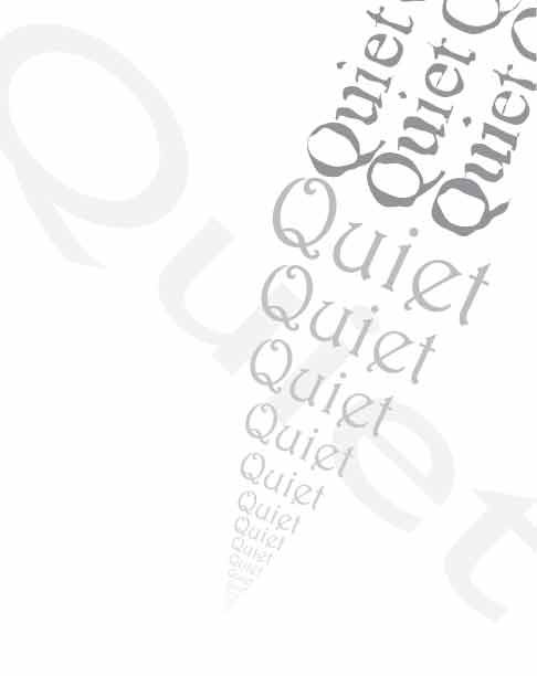
 After finishing loud, I started a design that would use only the word quiet, which ended up much simpler and, well... quiet!


The last one I've completed so far.  The word active was the highlight here, and I tried using colors here rather than just boring grays and blacks.
I don't think I quite got the hang of this one, but I could use some interesting ideas so I could possibly implement them into this design.

Tuesday, April 23, 2013

Result of me messing around with a few of Illustrator's features. I never got to use them all, but what has been modified here is what I understand so far.

Thursday, April 11, 2013

My paper bag design!


I have just finished folding the layout for the paper bag I've created, and this is how it came out!

     What I have in the design is the Himalayan mountain range from a very high perspective. Within it, you can spot a silhouette of a plane in the darkened area, and at the front there is the logo, which depicts Mount Everest in black and white. The sky has been edited to fit the theme of this design, which is supposed to be aesthetic.

     To get the attention of the onlooker, I've placed the mountain logo not in the middle of the bag, but a little to the side.  I thought this necessary because I felt as if the viewer should get drawn to more parts of the bag, rather than just seeing the centerpiece right away.

     
Within the design, there is a surprise that is not very difficult to spot if one is to keep searching all around the bag.  In the darkened area of the bag, there is a silhouette of a plane.
     
The best part of my design is the mountain range; the artistic redesign of the photographed mountains gives it an aesthetic look.