First off, I apologize for the awful quality of these; It apparently cannot get better than this for the internet.
Anyhow, I've recently started working on some typography designs, and these are the three I've come up with so far.
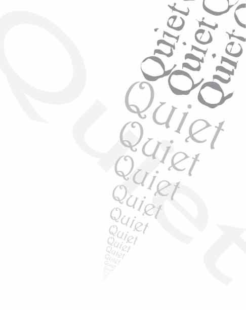
After finishing loud, I started a design that would use only the word quiet, which ended up much simpler and, well... quiet!
The last one I've completed so far. The word active was the highlight here, and I tried using colors here rather than just boring grays and blacks.
I don't think I quite got the hang of this one, but I could use some interesting ideas so I could possibly implement them into this design.


No comments:
Post a Comment